
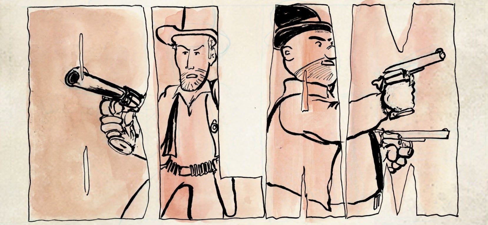
Letters in Action
Turn up the volume on written words

Hey Comics People,
In the first four issues of Making Comics we made our case that the visuals are the primary driver of this visual storytelling medium (shocker!). But now here we are, issue #5 time, baby, and we’re finally going to put our full focus on the words and letters that make their way onto a completed comics page!
And guess what?
We’re STILL pushing the visuals!
Heck, this post about ‘letters’ leans on imagery more than any issue of Making Comics thus far!
More specifically, this post is focused on sound effects and the various ways in which lettering can attract and hold a reader’s eye. Naturally, a fair bit of visual aid will help us today. But worry not, sicko word-lovers. Next week’s post will offer a giant pile of words to dive into as we get into the art of crafting a story. But for today, let’s just get splashed by some big n’ bold letters rather than drinking an ocean of ‘em. Cool?
Cool. Let’s get started…
BEHOLD, The Making Comics logo:
This logo is a fitting startling line for a discussion about lettering in comics. Because it’s an example of lettering that’s designed to serve as exactly that, a starting line. A logo is often utilizing big or otherwise bold and dramatic letters to grab eyes and get folks through the door. Our world is chuck full of this variety of lettering. There’s a silly amount of attention for eyes out there and logos often lead the charge. So when designing one for your comic, all the more reason to work with someone who knows a thing or two about attracting eyeballs. In our case, the Making Comics logo was designed by Eisner nominated letterer Pat Brosseau. He also designed some alternate options. Not surprisingly, they’re all distinctly eye catching:


Their eye catching nature is not surprising because Pat’s a professional letterer who’s done it all. Here are just a FEW of the many books he’s lettered over the years:
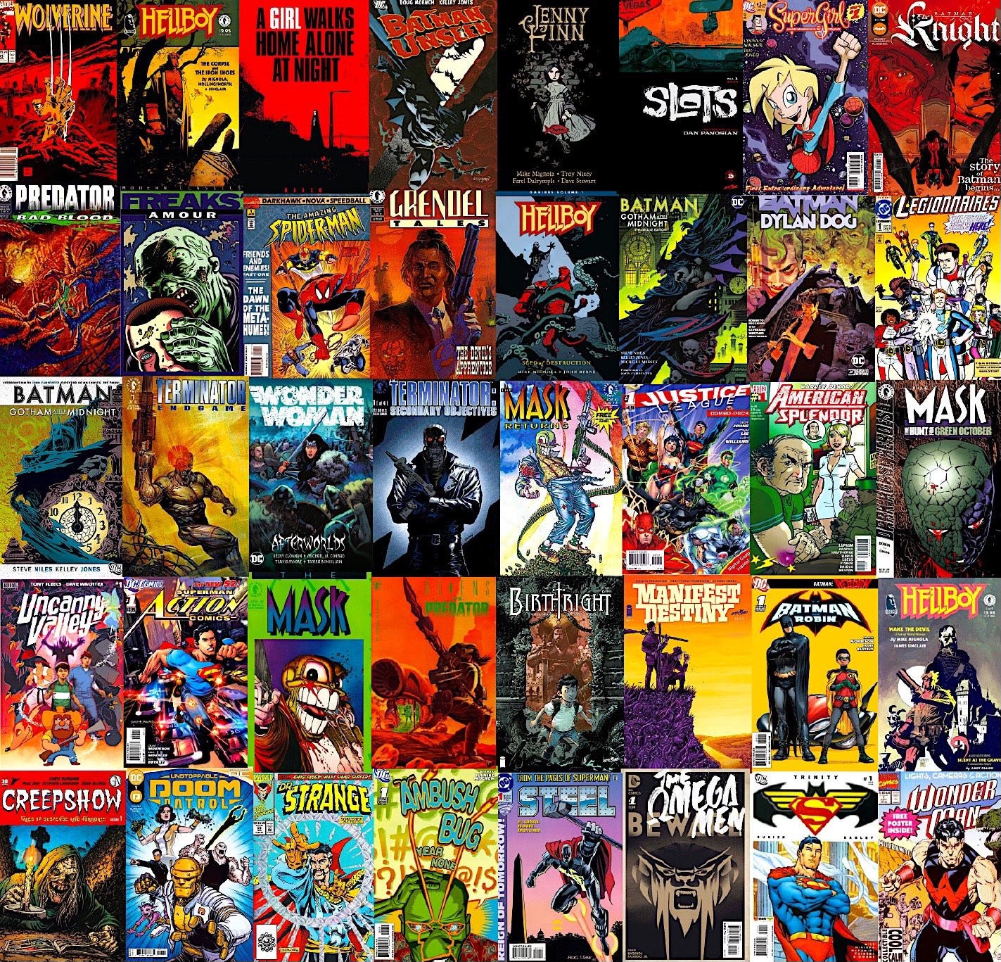
That dense (and incomplete!) lineup of books includes a great many established franchises, many having well-established logos, fonts and color schemes, all factors that a letterer will be prepared to honor and build atop. Fortunately, a professional letterer like Pat is up for the task. From page one, he’ll play a key role in catching our eye. Case in point, check out this sampling of some of his cover blurbs. These all come from his work on DC Comics titles:
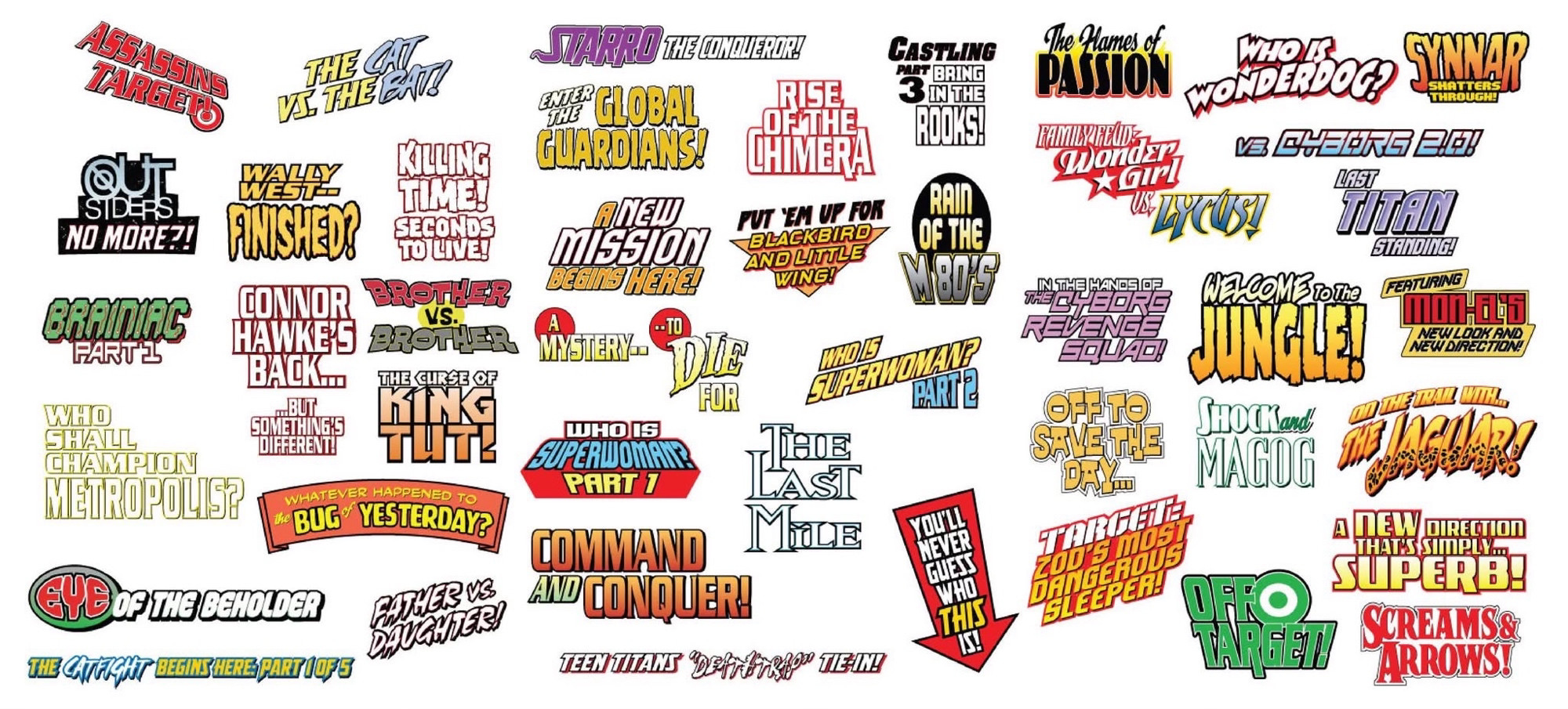
The lettering is usually the final addition to complete a comics page. Great letterers will assess a page’s composition, as well as factors such as an artists’ line work and the decisions of the colorist. Taking all of these existing storytelling decisions into account, it then becomes the letterers’ turn to make their mark on the page.
In the creation of just one issue of a comic book, a letterer will make hundreds of decisions which ensure that the words and sounds expressed within will catch the readers’ eye. Their work will inspire those readers to begin reading the comic, sometimes via a blurb like those above, which create an enticing splash of excitement to encourage an eagerness to dive all the way in.
But lettering isn’t just about CATCHING attention. No. Highly skilled lettering work will serve to hold and guide that attention, to help carry it along panel by panel and page by page.
You’ll notice that most professional comics have a dedicated letterer. This is not happenstance. There are a host of very good reasons that lettering is its own discipline.
I talked about this discipline recently; and I mean I literally talked about it, in this five minute recording. By the way, you may have missed this recording / post even IF you’re a dedicated Comics Person (which what I’m calling readers of this blog, until someone gives me a better name!), because I’m only sharing these ‘weekend reading’ posts via the Substack Chat feature. So keep an eye on that chat area if you’d like to share and discuss books we’re currently reading.
Anyways…
Lettering is a craft that is often the under appreciated ‘workman’ in the background of a comic. But in many cases, lettering can (and should) leap into the FOREFRONT of the storytelling!
If you’re anything like me, you went through a shameful period in which you questioned the very concept of a ‘letterer’. Loathe as I am to admit it, some of y’all might need to be broken out of the horror show that is ‘lettering ignorance’. Honestly, it’s as scary a spot to reside as is that haunted house in which folks question the value of inkers.
Lucky for you, if any visitors clicked on those wiki definitions I linked in the paragraph directly above, your secret is safe. I’m happy to lead us both to the door so we can begin to acquaint ourselves with the wide world of lettering that awaits us on the other side. Fortunately, we’ve found the door, and now all we have to do is twist the knob and push it open.
Shall we open the door together?
Ready?
Okay, just gonna open it a crack and—
You FEEL that?
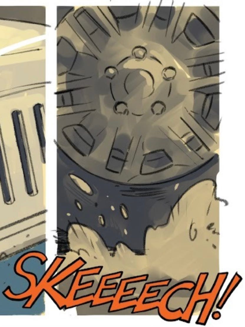
I know I did. And maybe you can see where we’re going with this. Feeling. IMPACT. That’s SFX, babe. Comic book lettering can and often should include sound effects (SFX). First of all, they’re fun. But more to the point, they draw the eye, they add emphasis and weight. They HEIGHTEN drama.
Even choices such as the size or shape of a word bubble (or the font choices held within) can create emotional chords to get the viewer tuned appropriately into the action at hand:

Sound effects also play an important role in ‘closure’, which is the process experienced by readers as they fill in the gaps from panel to panel to perceive a continuous story as it unfolds. A panel to panel transition can occur in a heartbeat of time, or a minute or two, maybe even days. Our ability as readers to take context clues and assess that passage of time is ‘closure’. As a visual storytelling concept, it’s a uniquely fundamental for comics. Because unlike movies or tv, which in this respect put your brain on easy mode and creates constant closure FOR the viewer, closure is a vital consideration for the funny books.
Oftentimes the biggest trick for comics writers and artists is towing the line of trusting the reader to create closure in-between panels vs beating them over the head with unnecessary detail in an attempt to create this closure FOR them (or conversely, not providing the reader with enough information. Like I said, it’s a fine line!). Lettering choices such as SFX can play a key role in creating that closure, they can signify a passing beat of time and unfolding action, however sudden.
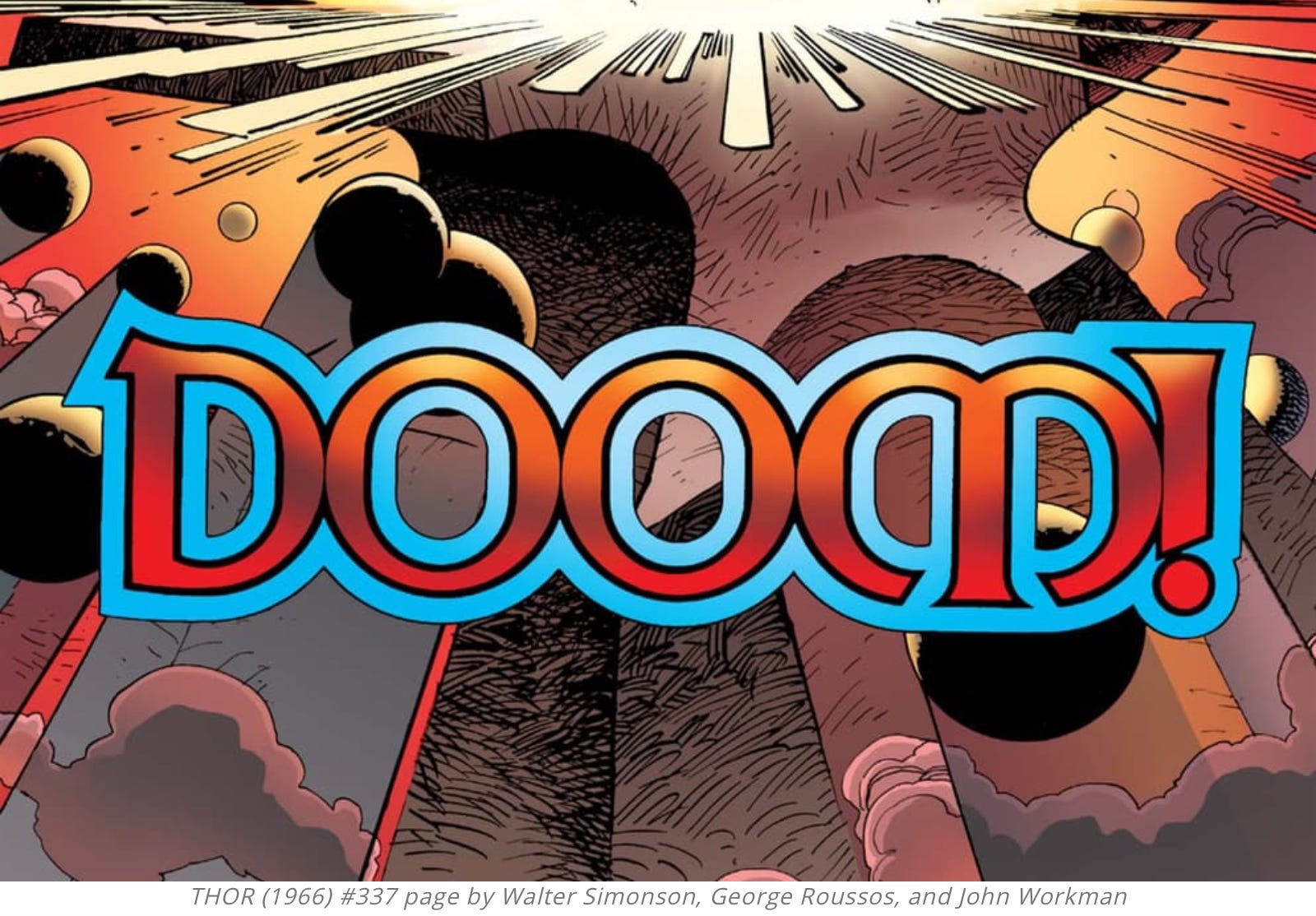
Case in point, consider the following image:
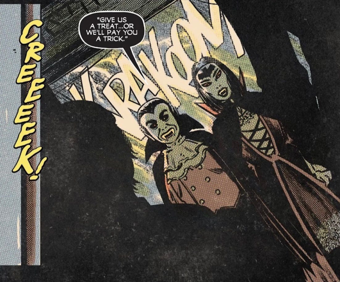
Now imagine this panel without the sfx. By removing all of that exuberant sound, the reader might assume that the question being asked by the vampires is being carefully pondered. This same panel would be the exact opposite of what we perceive with the sfx. This could be its own kind of drama, it could still hold the weight of the world even. But it would be quite different from the jump scare beat being conveyed WITH the sfx.
Here are some more examples. Check out this kinetic sequence from Big Shoulders #1, with some incredible SFX by artist Scott Gray:


Could you feel the impact there?
How ‘bout HERE:

See how the lettering fans out from the ‘KRAK’ sfx? Check out how the lettering aligns itself to the similarly fanning out red and black impact lines.
Can you hear a chord being strung with that font choice? Is it a harmoneous chord? Heck no. The oar-swinging fella (Dave Boguski) is strumming a heavy-ass note that is seriously out of tune. That dude is bringing down some DRAMA.
Okay… we’re dwelling on the visceral aspects of lettering in this post. In a future post we’ll get into the more subtle points of the craft and how it creates clarity and guides storytelling flow. For now, to tease that out, here’s just one example, a specific one which I mentioned here, and I want to show exactly what I was referring to:
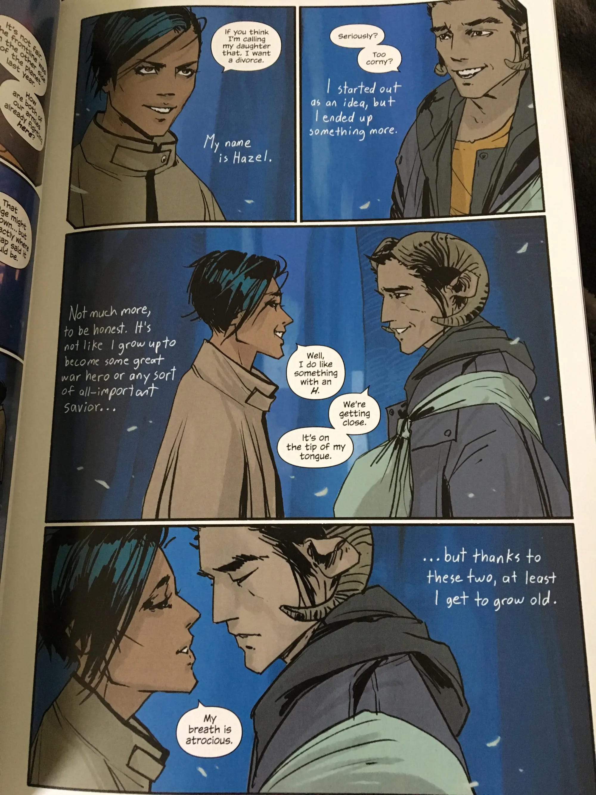

Note the handwritten text. It’s free of boxes. The writing itself is colloquial. It reads like a friendly voice from a campfire, or a freely-shared journal entry. Also worthy of note is the call and response from the future narration to the present moment. And what can you notice about the size of the fonts? Also, which perspective is more omnipotent and all-knowing, which more of the moment? Might the font sizes play into and reinforce these dueling perspectives?
I don’t have all the answers. But these are just a few considerations to ponder. Because the letterer certainly did.
The lettering placement, fonts and composition all serve to propel the power of this scene. This narration from the future is used sparingly in this story (Saga). So when this particularly lettering appears, the reader leans in, trained to expect some major clues and revelations. These lettering decisions were so impactful that they dove to the forefront of the storytelling in such sequences.
By the way, if you haven’t read Saga, at the time of this writing the first issue is free to read digitally (curtesy of the publisher, Image) via this link.
Note: Saga is an Rated R series.
OKAY. Now let’s get back to the mighty world of SFX. The title of this post is ‘Letters in Action’ so let’s do the thing. Let’s bring the noise and enjoy some great examples of SFX.
Here’s a famous one that I spoke about in detail in this post:
Seriously, if you’re not cued into that one, listen to the recording linked above…
Oh hey, do you remember this short from a couple weeks ago, in issue #3 of Making Comics? You can read the entire short here. Artist Bryan Boles incorporated some fun SFX:

Or how about this SFX cue in The Dog, by Scott Gray:

See how Scott’s use of SFX serves to guide our (and Mr. Jack Kirby’s) eyes into the next panel? That sound, and the lettering its built from, literally leads us around the bend. I’d suggest reading that story to see exactly how that is utilized in context. It’s a subtle but highly effective tactic.
And speaking of subtle, here’s the ‘snap’ sfx that haunts many Spidey-fans’ dreams…
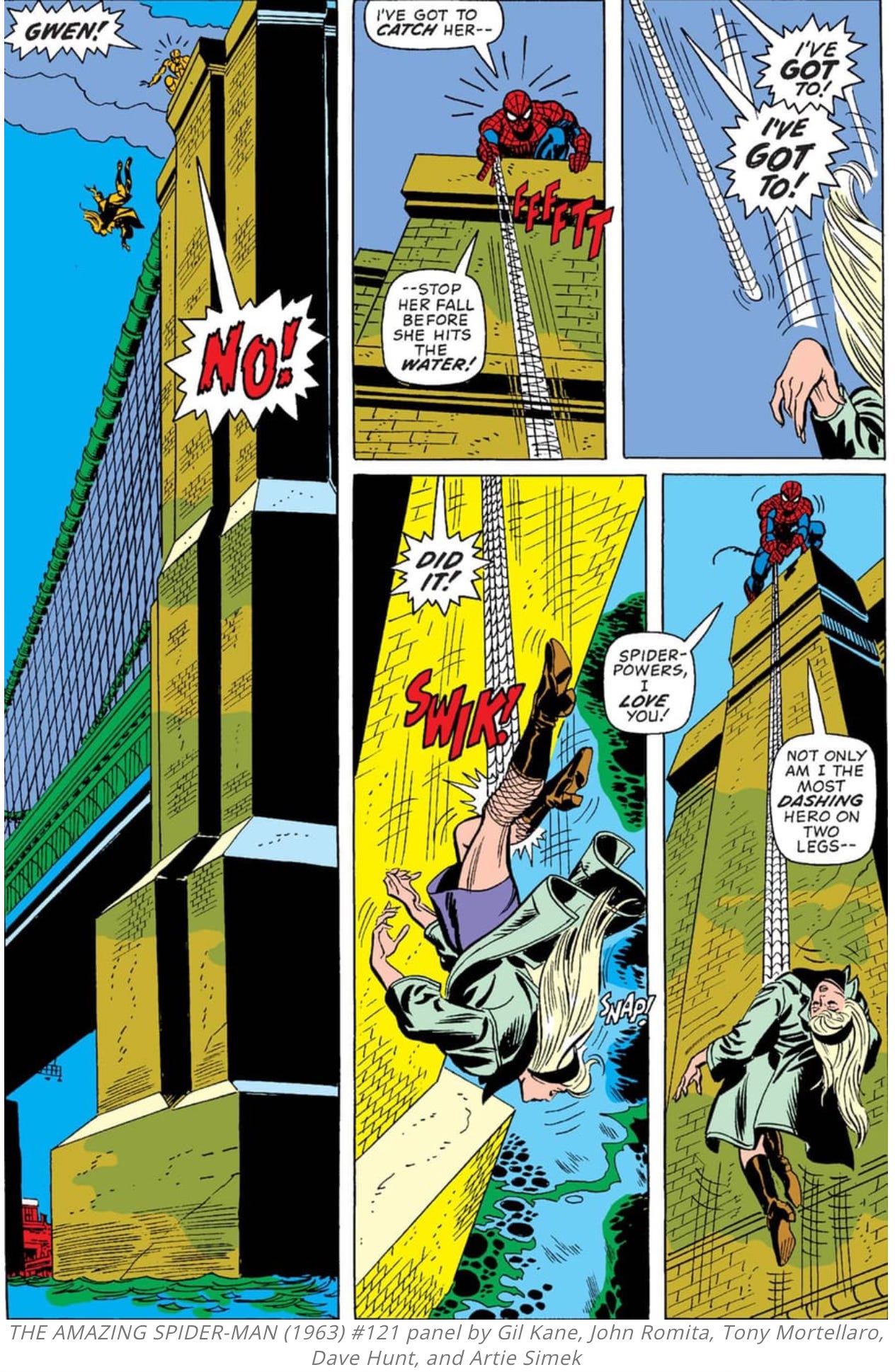
Apologies if you hadn’t yet been haunted by that ‘snap’…
It’s the most subtle sound effect on the page, and intentionally so. In the next panel, it’s all-too clear that Spider-Man himself didn’t even notice it. But he, and the reader will go back and read / hear it retroactively, again and again… However, there’s even more here to take in (because letterer Artie Simek was a true storyteller with his craft).
Note the jagged vs. non-jagged speech bubbles. Can’t you feel the temper of his voice changing as Spidey oscillates between the rounded and jagged bubbles? There’s yelling, and then there’s screaming. Those jagged bubbles really do create an anxious chord.
PSA - If your speech bubbles are jagged like that, your throat is going to hurt the next day.
SFX is a cool and distinctly VISIBLE piece of the letterer’s toolkit. Because it’s when their work enters the forefront of the storytelling. The reality is that 90% or more of even a letterer’s greatest and most clever work goes largely unappreciated. But it’s ALWAYS a major facet of the finished product.
Sadly, this is a craft that is too often only noticed in the rare cases where mistakes are made. Like, have you ever been reading a comic and accidentally read some boxes in the wrong order, or had your eye guided to the wrong panel? Now granted, in a lot of cases this can be a problem with the layouts which originated from the artist, or even a writer who may have over directed an artist’s page composition. But, whatever the case, it only takes ONE oddly-placed dialogue box to break our immersion. Such compositional mistakes are possible. But it’s a testament to the pros that mistakes are a rarity… or rather, it’s a rarity when true professionals are in command of the letters.
Here’s a key fact to hold onto…
The more you pay attention to a letterer’s work, the more stunning and praise-worthy it becomes. But it takes one crucial first step:
NOTICING.
Take note of the craft.
Perhaps you already appreciate the lettering in your favorite comics. I’m sure many of you do, and I’m also sure that many of y’all already notice more than I’m currently capable of appreciating myself. Whatever the case might be, and wherever you currently reside in your ‘lettering appreciation journey’, I’m curious:
What examples of lettering in comics have stood out to your eye?
Who are your favorite letterers?
And final question…
When has lettering been in the forefront of the storytelling in your favorite comics?
Shine a beacon on some of your favorite examples of the craft!
Alright, that’s a wrap on today’s issue. Bring on that logo (with thanks to Pat!):
We’ll be back next week, where we’ll finally get out our tweed jackets and discuss storytelling. To begin our way down that literati road, we’ll tackle the subject:
What drives a story?
We’ll also lay out some simple tests to determine if a tale has got the dramatic juice (as well as a few means to inject said juice into a tale, if need be!)
Until then, stay Spooooooky, Comics People…

And Quitely drawing sound effects with the objects in his frame—see the Dick Grayson Batman teamed up with Damian Wayne Robin series