Making Comics 1.0 - First Impressions
Cover art and first impressions

Hey Comics People,
Making comics is kinda tricky. Ugh. So let’s lounge up in the clouds for a beat. From a cozy spot up there we can peak down and simply admire the creation of a comic book page, step by step.
This is the first of a two part post, with a focus on cover art and first impressions that draw us in, with the 2.0 post (now available right here) diving into the process for completing a page of sequentials.
A standard issue of a comic book can be read in ten to twenty minutes. A wordy book might take up to thirty minutes. Of course the most hardcore of comic art enthusiasts might drool over a page or panel for who knows how long. The value a reader derives from enjoying a comic is immeasurable. But it’s true to say that for most readers comics are quick fix entertainment.
If only every reader knew what it took to make one of these damn things…
In the example above we didn’t even show the color flatting process, completed coloring and lettering, or dive into the dozen or more digital tools that go into the creation of a single comic book page. It’s a process. We should all be thankful that this beast of an assembly line doesn’t scare everyone away.
It’s a marvel to watch a comic book take shape. Making comics as a writer is basically just an excuse to grab a front row seat to watch comic artists at work. Or course, anyone can be a comic book artist (even a ‘writer’ who thinks they’re incapable of art!'). Like anything else, it’s all about study and practice. This is true. Still.. experiencing great artists at work feels like a magic trick just the same. It’s striking stuff.
Like many comics creators, my journey into the medium began with imagery that struck like lightning. I think it happened in an airport, of all places. There was a comic atop the magazine stand, where my eyeballs were lured into cover art that was perfectly designed to command their attention. Millions more were caught by this same trap:

There’s a reason X-Men #1 (1991) remains the best selling comic of all time. As far as I’m concerned, Jim Lee’s cover work across four variant covers ushered in ‘the 90s’. There have been countless other covers to lure comic readers into the hobby, and this wasn’t the first comic to take hold of my eyeballs, but it was a memorable one for me and so many others.

The right imagery is often what leads us through the gates, compelling us to take a look inside. A killer cover (and logo treatment!) will hold an eye as it scans the display rack. It’s a competitive game to stand out in some way within racks and racks of top shelf worthy work. So it’s all the more impressive when creators make their presence undeniable.
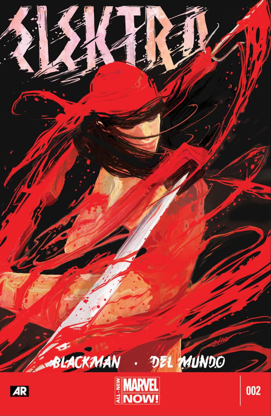
Case in point, here are some of impressive covers from one of my favorite contemporary cover artists, Mike Del Mundo:


The shape of Del Mundo’s cover imagery is something that can lock eyes from across the room, even before the definition settles in. It’s like art you might remember from childhood, shapes and contours that you can recall with such clarity even without conjuring the details within, a commanding shape can pull in the eye. Mike Del Mundo not only pulls this off with notably dramatic composition, but he then holds eyes with movement and detail.
His Elektra covers, in particular, always come to mind when I think about eye-catching first encounters. Because… well, they caught my eye. I had zero intention of picking up these book when I walked in the shop. These images are quite violent, but also capture a ballerina-like grace and art-of-precision befitting the character being explored within. It’s a juxtaposition that’s hard to ignore:
Here’s a few more for good measure, as I feel like this is a mini-series that hasn’t gotten as many flowers as it deserved:


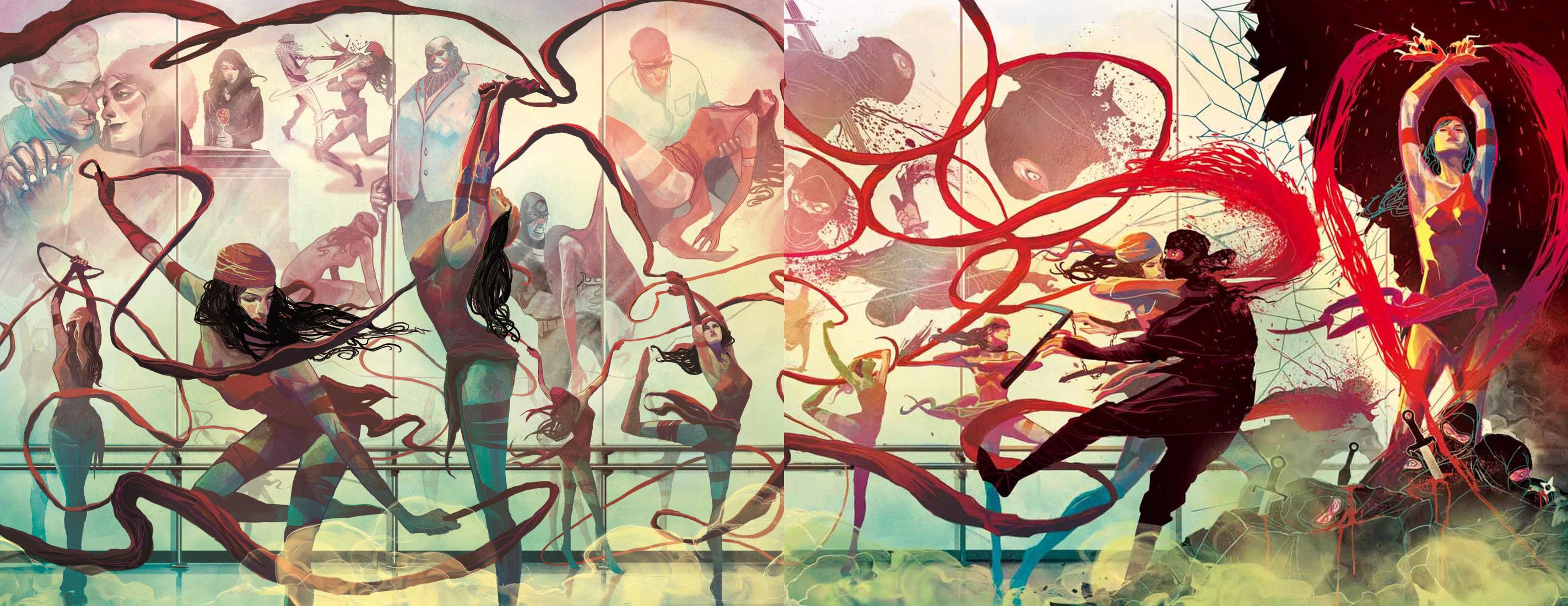
Oh yeah, and Mr. Del Mundo’s interior work is as exceptional as his covers by the way…
But before this turns into a Mike Del Mundo / Elektra Stan post, let’s just circle back to the point that his covers break the mold and beckon the reader to the door. What’s ‘eye catching’ is often subjective, but for my eyes, his are examples of covers that stand out among the pack.
Now it’s kinda ironic that I’ve led a Making Comics 1.0 post with all this talk about covers. Because, well…
Covers can lead a reader’s journey into a comic. But the cover (and logo) generally shouldn’t be the first visuals produced in a comic’s creation…
A cover design concept can be affected and greatly improved after interior pages have been completed. A script can be where a story begins, technically. But the development of the sequential art is when the visual language of the story begins to reveal itself. Only then can a logo and cover concept be devised to best reinforce what readers are going to discover inside.
I’d go as far as to say that, when possible, the cover should be the last visual produced. But this isn’t advice I’ve ever followed. Reality intrudes. It’s hard to deny the fact that a cover and logo treatment are instrumental marketing tools and in the indie and self-published comics game, you’re probably going to need them before the book is done.
So here’s two best practices I’d suggest:
Before designing a cover image, produce at least a bit of the interior work first to let the story and its tone more fully reveal itself.
Create a cover image and logo with a tonal alignment to reinforce the storytelling within. I’ve often been burned by cover art that provides a misleading first taste (including, I must admit, covers by Mike Del Mundo which do not feature his interior work…).
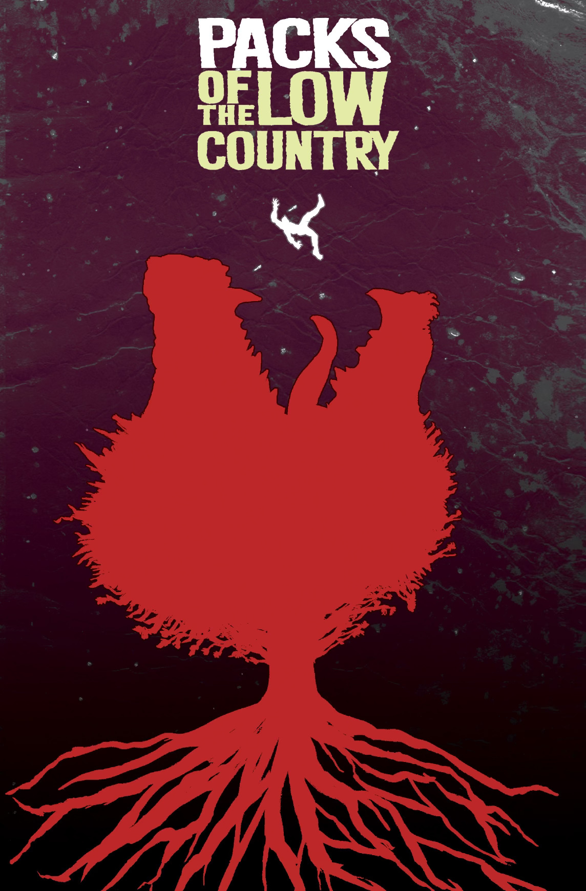
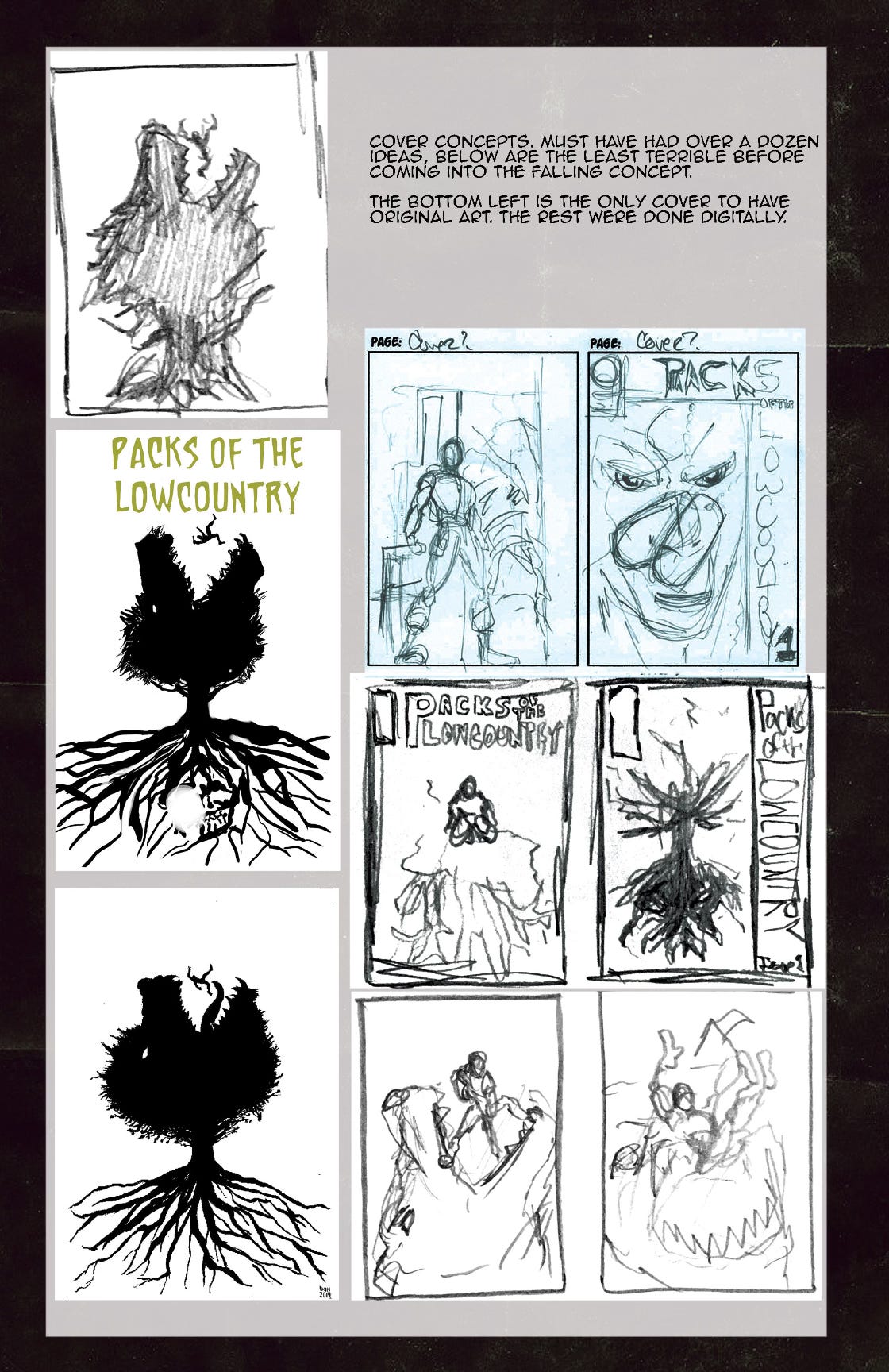
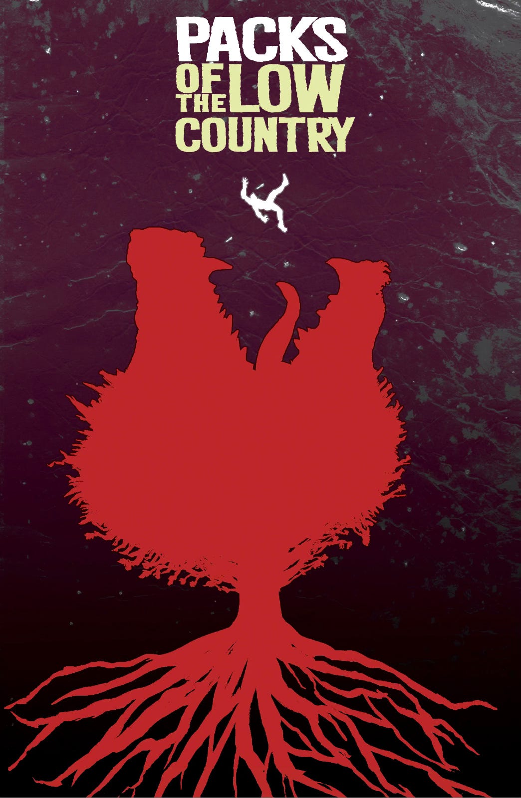
I was lucky to stumble my own way into this order of operations when working on the two full-length comics I’ve completed so far. This was our approach for designing covers and logos when I worked with Don Cardenas on Packs of the Lowcountry (POTL) and Scott Gray on Big Shoulders. Take a look at our discovery process towards these end goals, staring with the cover for POTL #1:
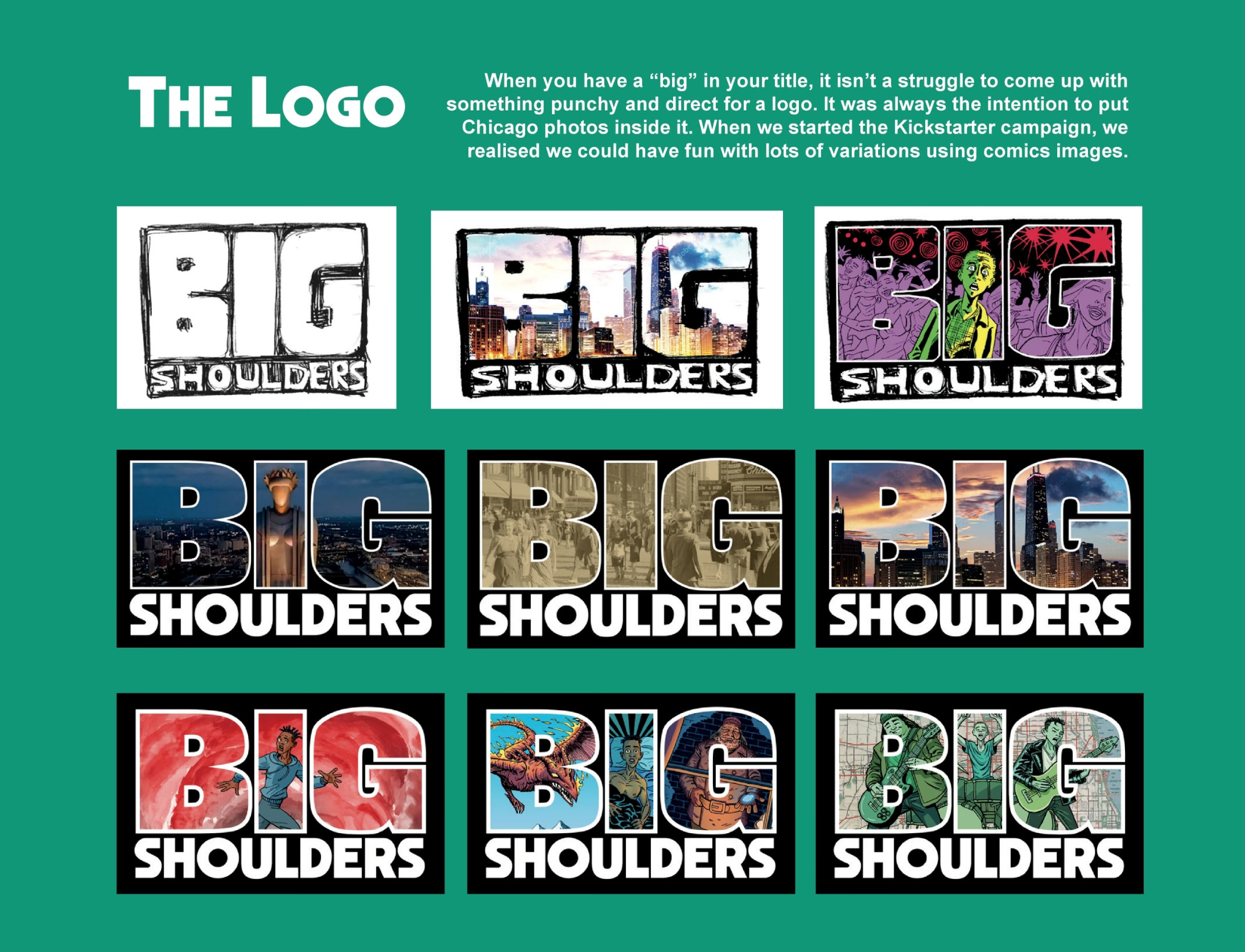
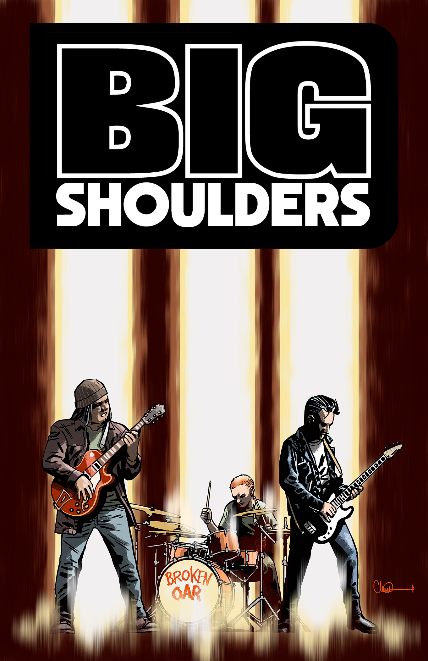
More recently, in Big Shoulders land, I’ve had the immense pleasure of working with Scott Gray and getting to watch his process in creating our logo treatment!
Here’s a breakdown for the Big Shoulders’ logo’s creation journey:
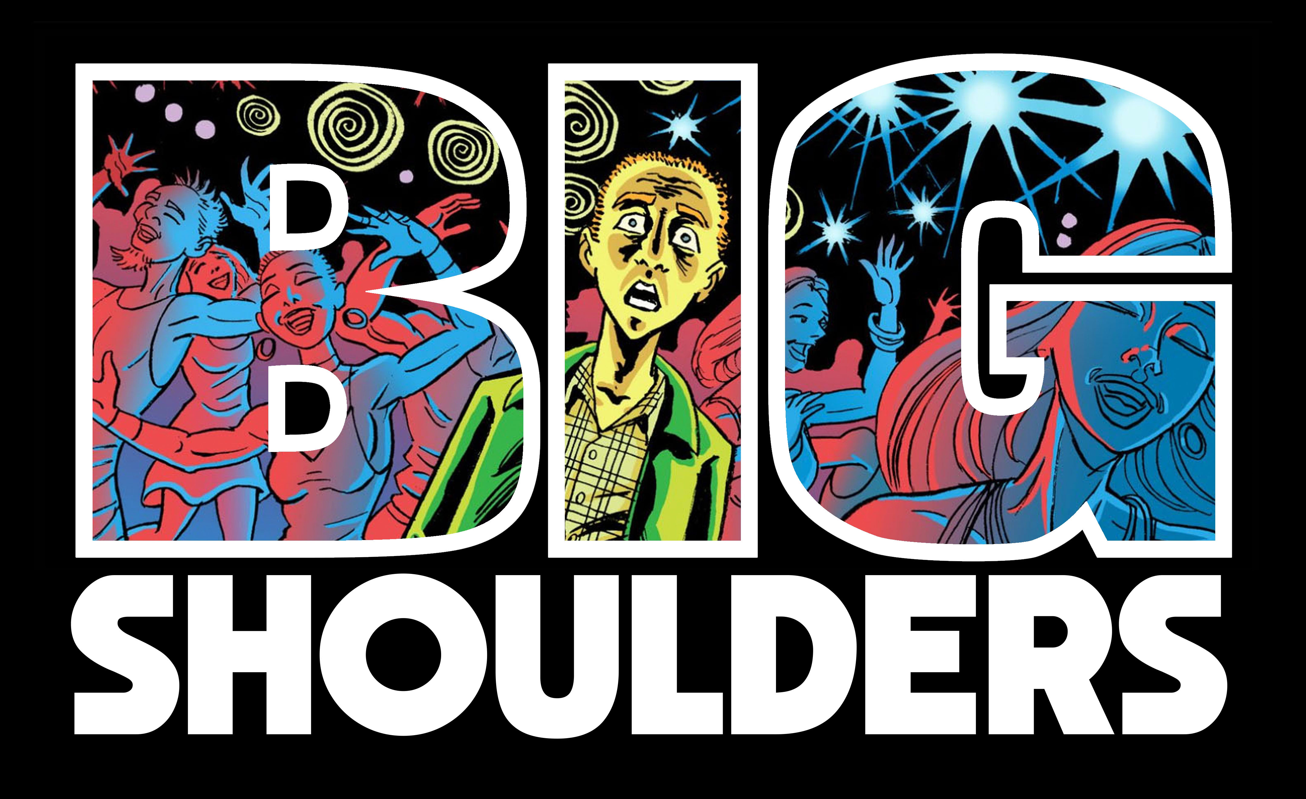
Following the development of our series logo (which we worked on for several weeks!), we produced on two covers. Cover A by series artist Scott Gray, and Cover B by Charlie Adlard:
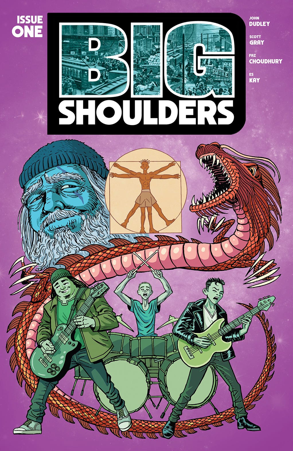
And we were lucky to have copies of Big Shoulders #1 make the ‘new release’ shelves at a few Chicago-area comic shops a few months back:
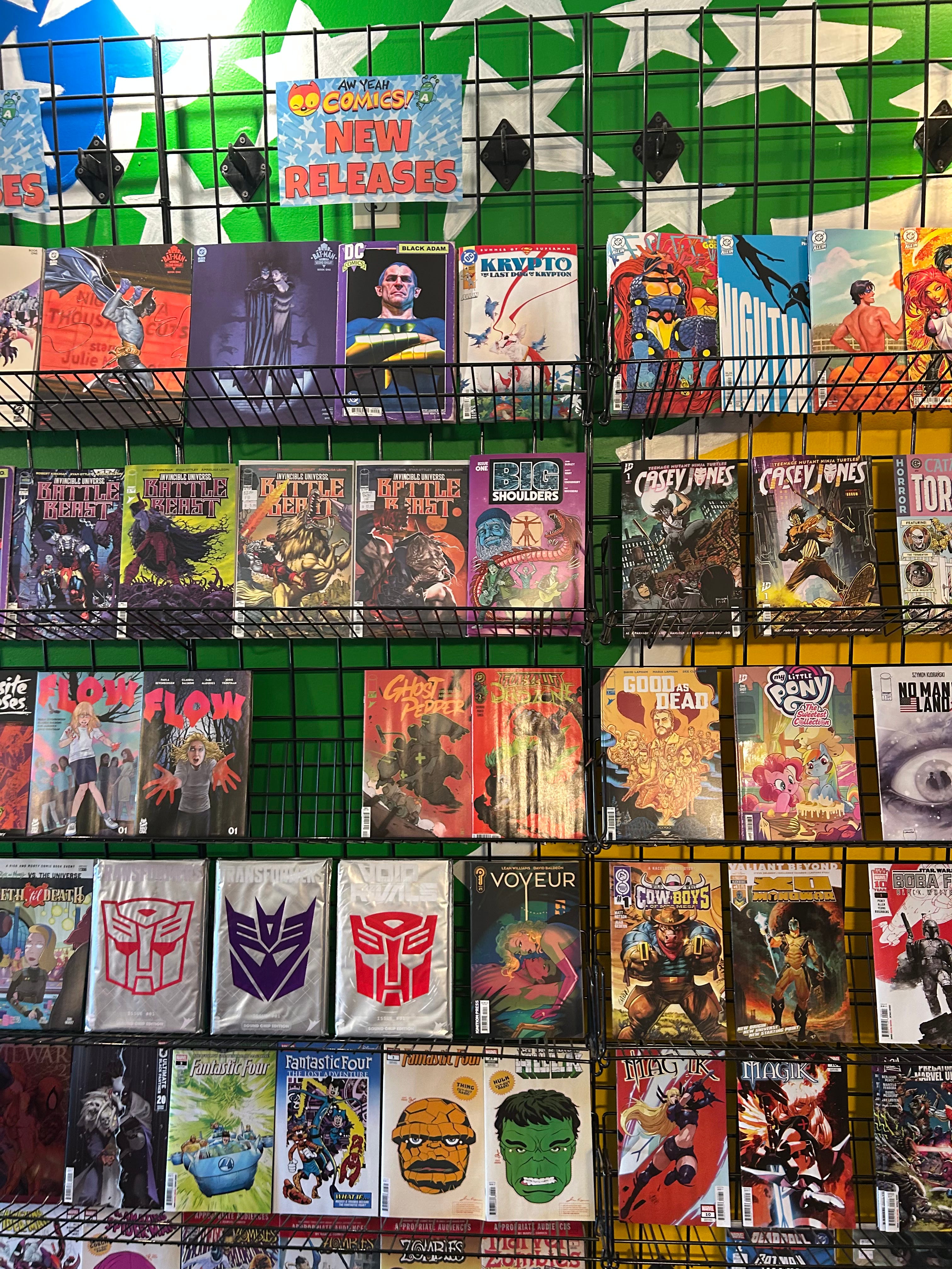
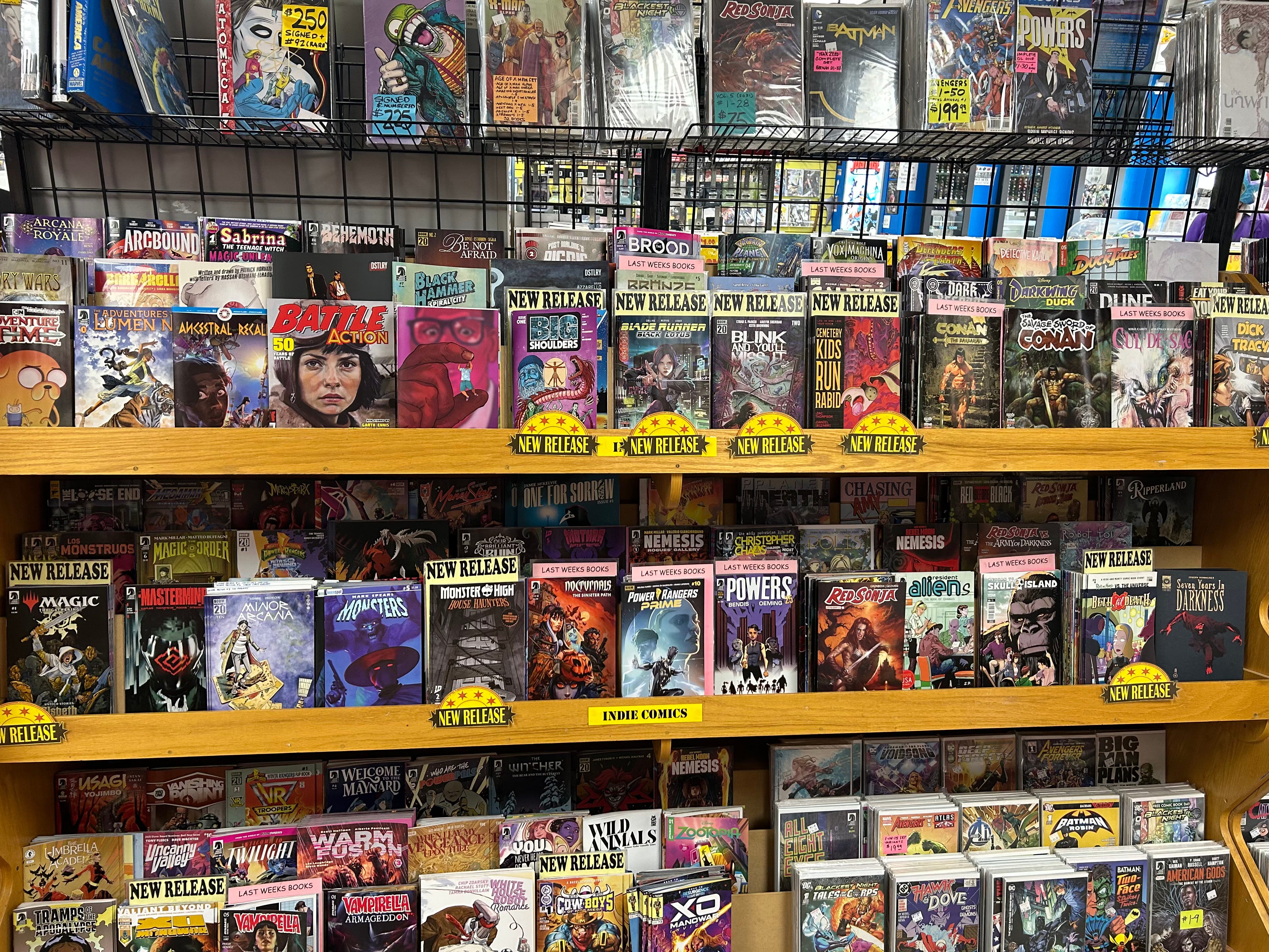
I think Scott’s (and Mr. Adlard’s!) cover treatment stood out pretty well among the pack. I also feel that readers and would-be readers will find those covers to well represent the journey they’ll find within.
Remember…
Covers and logos aren’t the ideal place to begin the ‘making comic’ journey. In part two of this post, let’s break down where the creation process ought to start…
And finally, it’s been a minute since I’ve shared a free comic in this space. And fortunately, I’ve got a groovy one to share. In fact, it’s one of the books I’ve been sharing content from in this very post, and it’s the first full-length comic I ever completed.
There will be ANOTHER Making Comics post dropping soon, featuring the first chapter of Don Cardenas and my six part comic series, Packs of The Lowcountry. Prepare to jump…
Keep your eyes open for the first chapter of POTL in your mailbox. Till then, let’s all dive back down to earth where we get to have some fun…